Document Controls
Leverage the power of touch screens, GPS, cameras, photo mark-up, and more using the Field Squared Mobile App Builder’s set of sophisticated field data capture controls. Any Excel or complex paper-based process can be automated in our platform using document controls and a little bit of work.
Standard Controls
Field Squared standard document controls are used for making top-down layouts in forms. They can be mixed with flow controls and added to any document or sub-form.
 |
Asset | Allows for the search and selection of an asset |
 |
Auto Number | An alpha numeric set of characters that auto increments with each new form created. |
 |
Barcode | Allows the use to scan a barcode with their mobile device. |
 |
Catalog | A catalog where you can navigate between complex objects. |
 |
Catalog Combo Box | A list where the user can pull values from a catalog and optionally supply their own value. |
 |
Catalog List | Allows the user to select single values from a catalog from drop down. |
 |
CheckBox | A control to indicate a yes/no choice. |
 |
Check List | A list of labels/check boxes to indicate a choice to your choice of questions. |
 |
Check In | Logs the current time when the user presses a Check In button. |
 |
Combo Box | A user selectable list in which you can optionally supply your own values. |
 |
Command | Executes a workflow on button press. |
 |
Contact | Allows for the search and selection of an existing contact. |
 |
Container | Groups all controls below it, up to the next container control, hiding or showing all of them based on HiddenIf. |
 |
Current Date | Displays the current date when the form is created or each time it's opened. |
 |
Date | Displays a date picker on a form which includes configurable format options. |
 |
Date Range | Displays a start and end date picker. |
 |
Details Table | A Details Table displays a configurable summary of any sub form assigned to it. |
 |
Fragment | Imports or inserts a form fragment. |
 |
Graph | Calculated data in a line chart from Details Table Values. |
 |
Hyperlink | A control which allows you to add hyperlinks to you documents. |
 |
Initials | Allows for the input of a persons initials. |
 |
Label | Adds generic labels to the forms. |
 |
List | Allows the user to select single or multiple values from drop down. |
 |
Location | Records the current GPS location for an address. |
 |
Math | Allows complex math functions to be performed on numbers. |
 |
Options Item | Display a checklist with labels and photos. |
 |
Options List | Shows a report where each line of the report contains a label. |
 |
Page Break | Creates a break in the page of a printed PDF. |
 |
Person Name | Inputs for a person's full name. |
 |
Photo | Allows the user to create or upload a picture to the form. |
 |
Photo Collection | Allows users to add a series of photos to a document. |
 |
Photo Comment | A single photo can be taken and then comments added to it. |
 |
Photo Survey | Multiple questions and answers in a singular control with accompanying photos. |
 |
Pie Chart | Calculated data in a pie chart from Details Table values. |
 |
Section Header | Provides a major heading inside the document. |
 |
Segment | Provides a list of options for users to select from. |
 |
Signature | Capture multiple signatures by drawing your signature with your finger. |
 |
Slider | Slider controls which allows users to drag their fingers to enter a number. |
 |
Smart Text | Allows rapid entry of text using custom keypads including Siri dictation. |
 |
Sub Heading | Provides a major Sub heading inside the document. |
 |
Survey | Multiple questions and answers in a singular control. |
 |
Text Area | Allows entry of normal text into any document you create |
 |
User | Allows for the search and selection of a user. |
Flow Controls
The Field Squared app builder's flow controls are used to make flow layouts that are configurable to your specifications. Each control can be placed in front of, or after, any other flow control.
Flowing them together they will appear as columns in both the webapp and mobile app. This is a great way to organize your document controls within your forms in the Field Squared mobile app.
NOTE: Flow controls do not work on mobile phones. They can auto adjust to fill in gaps when fields are added or removed and they will always adjust to be top left to right.
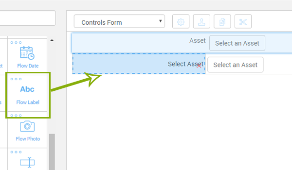
Flow Controls do not have labels. If you want to display a label on a flow control you will need to use the flow label control.
You can use flow controls to make grids and tables. You use custom width sizes for flow elements to put multiple fields in a row.
You can set borders to put your controls into a grid. When setting borders only select the borders that make sense given it’s location. A control on the far left of the screen will be top left and bottom border. No right border so the control next to it can have a left border to align with the adjacent control.
If you want to have multiple documents you must click the “Allow Multiple” checkbox on the right. This will allow more than one form to be submitted per task that will be attached to the task with a timestamp of when the from was completed
 |
Flow Asset | Allows for the search and selection of an asset |
 |
Flow Barcode | Allows the use to scan a barcode with their mobile device. |
 |
Flow Catalog Combo Box | A list where the user can pull values from a catalog and optionally supply their own value. |
 |
Flow Catalog List | Allows the user to select single values from a catalog from drop down. |
 |
Flow Checkbox | A control to indicate a yes/no choice. |
 |
Flow Check In | Logs the current time when the user presses a Check In button. |
 |
Flow Combo Box | A list where the user can optionally supply their own values. |
 |
Flow Contact | Allows for the search and selection of an existing contact. |
 |
Flow Date | Displays a date picker on a form which includes configurable format options. |
 |
Flow Image | Displays an image of your choosing within the form. |
 |
Flow Initals | Allows for the input of a persons initials. |
 |
Flow Label | Displays static text on a form with a configurable number of lines and text size. |
 |
Flow List | Allows the user to select single or multiple values from a drop down list. |
 |
Flow Math | A label which displays a calculated value from other inputs in the form. |
 |
Flow Photo | Allows the user to create or upload a picture to the form. |
 |
Flow Segment | Allows the user to select a value in a horizontal list. |
 |
Flow Spacer | Allows for the use of a space between controls with a configurable width. |
 |
Flow Text | A text box which supports a wide array of configure options. |
 |
Flow Text Area | A small box which will take text input within a form. |
 |
Flow User | Allows for the search and selection of a user in a flow layout. |