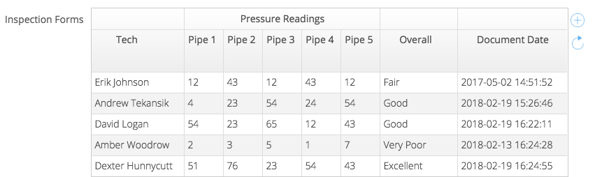
Document grids are a powerful custom field that allow a user to have access to related documents of a task, asset, user or team. Document grids give users an at-a-glance view of document data, without having to open multiple documents.
Configuring a Document Grid
- The first step is to add a document grid custom field to the object. Once added, there will be a gear icon on the far right, which, when clicked, will open the properties menu.
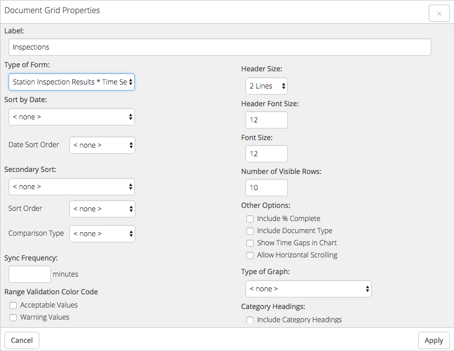
- Label: The custom field label that will be visible on the object. Required.
- Type of Form: Grids can be based off all document types or a single type from here. Required.
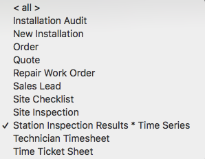
- If < all > is selected, there will be a menu for types to exclude. Any type checked here will not be visible in the document grid.
- Time series documents will be noted with '* Time Series' appended to the end of the type name. Learn more about time series documents here.
- Sort by Date: You can choose sort by date created, date last updated or, if it is a time series document, document date in ascending or descending sort order. Not required.
- Secondary Sort: You can select an ascending or descending sort from all available data columns from the document type. Not required.
- Comparison Type: date, number, or string (anything not a date or number)
- Sync Frequency: A value in minutes of how often the document grid will auto refresh and get the most recent data. Not required.
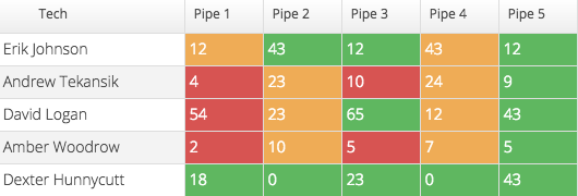
- Range Validation Color Code: If range validations have been configured, you can choose to highlight grid values based on their range status. If checked, acceptable values will be green, warning values will be yellow, and error values will be red. Read more on range validation here.
- Header Size: The height of the header in lines of text shown. The default is 2 lines.
Default Header Size vs 4 Line Header Size
- Header Font Size: The font size of the text in the header only.
- Font Size: The font size of the text in the body of the grid only.
- Number of Visible Rows: The display size of the document grid. For example, if set to five, the height of the grid will be such that five rows of data will be visible. The grid can contain many more documents, which will be visible by simply scrolling through the grid.
- Other Options:
- Include % Complete: Adds a column with the document complete percentage. This can be configured in Forms Builder.
- Include Document Type: Adds a column with the document type.
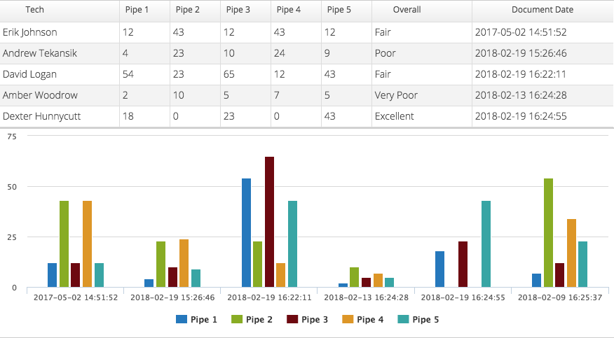
- Show Time Gaps in Chart: If there is a chart based on time, the x-axis will extend to cover all dates, not just the dates that contain data, giving an accurate picture of progress over time.
- Hide Document Grid: If a chart is enabled, hide the grid and show the chart only.
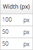
- Allow Horizontal Scrolling: Each column can be assigned a pixel width and the grid will extend beyond the horizontal bounds. You can scroll to see the entirety of the grid.
- Type of Graph: Choose between bar, line, bubble or pie. Not required.
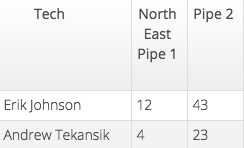
- Category Headings: Allow for a second header in the grid that can extend over multiple neighboring columns. When selected, simply give the rows them the same category name and it will extend across those columns.
- Tablet and Phone Settings:
- Tablet settings will be what is shown on the Web App as well as tablet sized clients.
- Phones settings will be what is shown on any device smaller than a tablet.
- Width: If horizontal scrolling is enabled, set the pixel width of the column
-
-
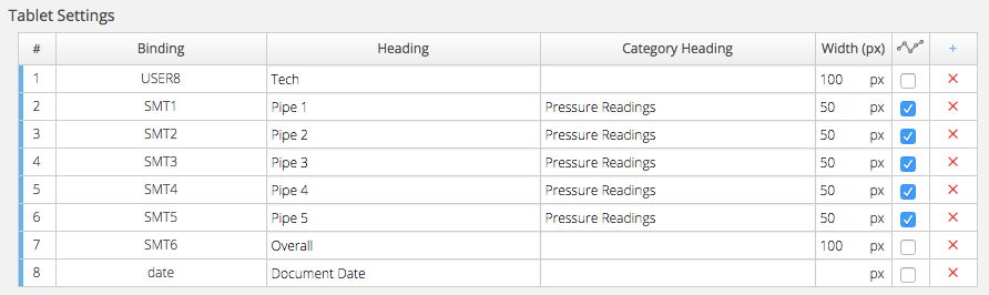
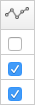
Setting Column Widths - Chart Icon: When selected and a graph type is selected, this column will appear in the chart
-
-
Selecting Row to Chart- Adding Columns:
- To add a column, click the blue plus icon in the upper right. The controls will be listed as they are configured in the document, listed with Binding and Title.
-
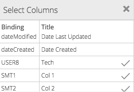
Adding Columns - When checked, the control will become a column. The user can change to the name of that column to better suit the document grid if necessary.
- Drag and drop columns to reorder the grid by clicking and holding the blue handle on the left of each row.
- Mirror Tablet Settings: Clicking this will apply the tablet configuration to the phone configuration.
- Adding Columns:

Assets and Document Grids
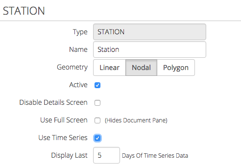
- Asset types have the ability to limit how many days worth of time series documents are displayed.
- Within the asset types editor, select Use Time Series. Set the amount of days in Display Last __ Days of Time Series Data.
- Any time series document grid on that asset type will only display documents with a Date value that fall within the last however many days.
-
Asset Time Series - The Date value is set in the document header of a time series document.
-
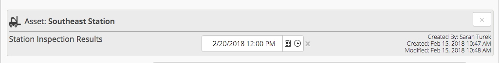
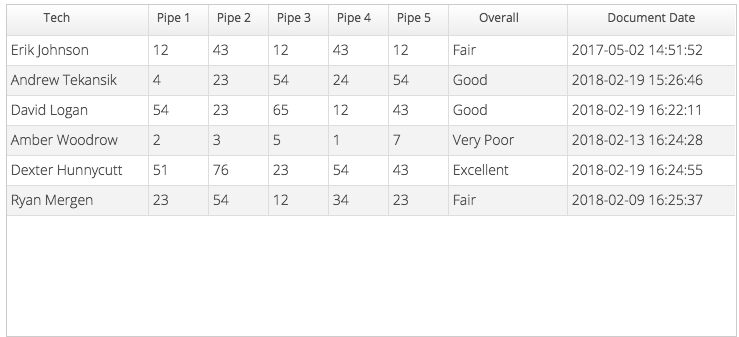
Document Date Header

