Combo boxes and Flow Combo Boxes
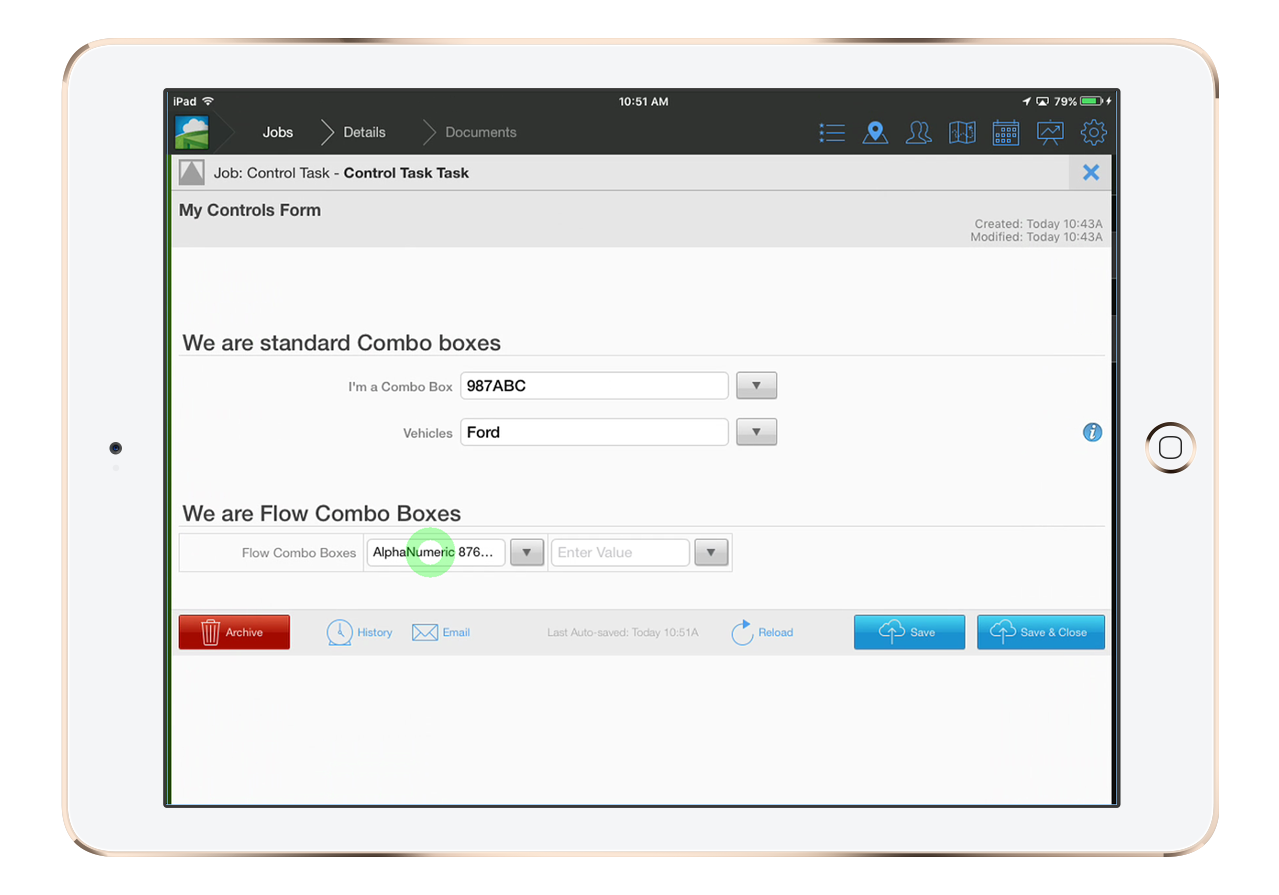
Combo boxes are drop down lists where you can optionally add your own values or use the values provided from the document builder.
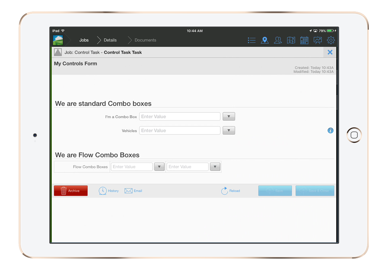
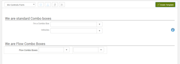
There are to variations(see above images). The standard version which is placed one above the other and the Flow version which can be placed next to other flow controls and arranged in rows. Both controls serve the same function but are placed and used within a form a bit differently.
Settings
Each version has it's own customizable configurations. They mostly share the same settings. Flow controls also have the additional benefit of adding borders to around each flow control.
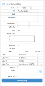
Flow controls can also be set to span 1 or more rows. Meaning you can have extra space for each control within a document.

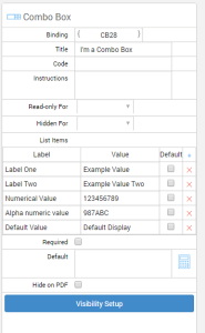
Building List Items
Each control has it's settings such as bindings, Titles, visibility settings and more. Combo boxes must have their labels and valued set here in the settings.
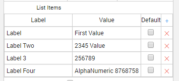
The Label will be displayed in the drop down menu.
The Value will be displayed in the input box and can also be changed after it' been selected.

Values can be text or numbers or a combination of the two. Any list item can be selected to be the default display item when the document loads.